Roses Design Awards
We went to Manchester to see the results for the roses students awards. we were please to find out that emily had won the brief that she entered. We found out by her work being up on the board with a sticker next to it with winner in pencil. It was a lot different than the entyce creative awards that was a sit down dinner and ceremony. My work wasn’t even put on the wall which wasn’t fair as I’d took the time to enter, they just had the runner ups there. When we arrived we said what University we were from to get a sticker but they didn’t even have one with Glyndwr or NWSAD on it, this was bad when one of the winning students was from that University. The winners had been judged that day and when the names of the winners were announced half of the students weren’t even there which was a shame. Emily was given a certificate and was told who her placement was with. It was a very informal ceremony. We left shortly after the winner were announced.
Alan Fletcher Exhibition- Manchester
Described as ‘Britain’s best ever graphic designer’ by the Observer and ‘one of the giants of 20th Century design’ by the Guardian, CUBE Gallery is delighted to announce that a major retrospective of Britain’s most celebrated graphic designer is to be showcased in Manchester.
Alan Fletcher: Fifty years of graphic work (and play) was opened on Thursday 21st January by Peter Saville, who worked with Fletcher at the legendary design practice, Pentagram.
‘Alan was ever-aware that what touched him had the potential to touch others. His open-minded panoramic view of the world always allowed him to see when something was good, regardless of its provenance’, Peter Saville, Creative Director, Manchester.
I went to see Alan Fletcher’s exhibition at the cube in Manchester. It showcased 50years of his work. Alan Fletcher was a typographic based designer, he changed his style with the times which makes his work more remeberall.
I particularly liked his black and white line drawings. His line typography looked simple but striking, I was very drawn to these images even though they were only small. They had an aesthetic appeal to them. His collage typography looked fun and fresh, they worked really well, he’s promoting sustainability by using recycled materials in his designs.
Also showcased with his final pieces was an archive of his ideas and mockups, it was really inspiring to see the way he worked.
One piece of work that really stood out for me was a branding piece that was made out of holes, it was so simple and clean but at the same time it stood out
Tony Brook and Adrian Shaughnessy of Unit Editions
 Before the talk I was lucky enough to get the chance to meet Adrian Shaughnessy and Tony Brook. We met them in a pub in the printworks in Manchester. They gave us some tips on applying for jobs, interviews, work experience and portfolios.
They told us when applying for a job if the cover letter doesn’t stand out or if there’s any spelling mistakes your application would get ignored. Headers on a cover letter are important.
Create a good pdf of work.
Make yourself indispensable on work experience by being enthusiastic and help out when needed for example making tea, collecting things for them. This will make you more remeberall and even if there’s no jobs going there your going to be more likely to be recommended for other jobs.
A portfolio shouldn’t be in an art case don’t talk about your work. it should show visually what it means. Show them your portfolio don’t show yourself.
Digital skills are extremely important when getting a job.
We then went to the talk at the odeon in the printworks.
Adrian and Tony have set up their own publishing company. Their first publication was called studio culture which shows the insights into studios across the globe, looking at their studio spaces etc. This I found really interesting and I’m going to purchase the book. Their next book that is out in autumn is called supergraphics looking at design in the environment which is something i enjoy.
They recommended some books to read they were:
It was a really enjoyable and worthwhile talk.
Creative Futures Week
Monday
Promofix- promotional marketing
www.promofix.com- merchandising agency
History
Graphic design apprentice
Marketing at Uni
Marketing Executive and Account Manager Coal Port
Roles
NSPCC
Chairperson of Telford young professionals
Award winning young entrepeneur
Case Study
Quest 88
Therapy through activity
Standing/therapy/cycling/walking
Disabled products for kids
A bike was made for disabled children to boost sales Promofix created different colours such as pink/black/silver-this increased sales.
branding is accessible across everything
Accessories for the bike were designed to boost sales including accessories and wheel covers.
designing not just the obvious.
“design is all around us- so the opportunities are endless.”
“Use your ideas in a practical way adapt to clients needs.”
see what the going rate is- don’t under sell yourself.
Starting your own enterprise start small but think big. Understand social media and new media. Use your skills to make you stand out.
Linked in- business facebook it’s a social media that clients can review you.
Explore and look for inspiration.
A business isn’t one without an accountant.
This was an inspiring talk by a young woman called Kathryn Holloway from Shropshire who had created her own business at a young age. I could really relate to her as she’s from Shropshire where I’ve lived for 15 years. She is a very positive role model.
Also during this day we received talks from Gary Greenwood, Tracy Simpson and Vicky Reynolds these talks didn’t relate to me and at some points the information was heavy. I don’t intend to set up my own business so i didn’t enjoy the day.
Tuesday
Chris Ramsden Chartered Society of Designers
Getting a job in design
We were told at the beginning of the talk that Chris wasn’t going to talk about getting a job in design as advertised above he was going to talk about his life as a designer. Basically he just showed us his work in a presentation. It was good that he had helped loads of people in space and with disabilities but we thought we were going to have a talk on how to get a job which is more relative to “creative futures week.” I was looking forward to this but was disappointed by its content.
James and Stuart from Thoughtful Manchester
What does an employer/ client want to see: Portfolios and CVs
This talk was without fail the most interesting and worthwhile talk throughout the 3 days it was very helpful for students getting into the design industry.
Keep in touch with companies by showing them new work, show your progression.
Preference of medium for 1st contact
- email 75%
- post 13%
- in person 12%
- Don’t make the email generic be personal to them.
- always attach work to your emails, then phone up after email..
- Dear…………….. my name is…………,I want to work with the best, you are busy people. I will make tea.in a small studio personality is a real issue.Im the nice to have around type. i work alone. i shall not sigh loudly as if i’m really bored all the time.
Michael Johnson
Pdf-between 5-7 briefs-5mb
be prepared to do placements and work experience
send them cake
book to give them
photography concise
Portfolios
- WireO-band book-esay to update
- Smaller book for logos
- Screw post book
- Carrying case
- saddle stitched book
- spiral bound
- i-pad moving images
- brief case
- holiday suitcase
- russian doll boxes
Most Common mistakes in portfolios
- spelling mistakes
- people who talk to much
- names spelled incorrectly.
Patrick Baguley
Be interested rather than interesting
you can not not communicate
Johnathan Baldwin
- Go to talks
- talk to other students
- go to galleries
How many pieces in a portfolio
10-20? 8-10? 12?
start with best finish with best
Paula Scher
be interested in what they do and you can learn from it, it’s inspiring
you admire them
Expected length of interview
30 mins
Which studios you want to work with
- start a dialogue today
- send a short professional email
- make a phone call 3-4days after
- A3 book style portfolio 10-12 pieces of work
- prepare for a 30 min interview
- always send a thankyou email
- never give up
Wednesday
How to get a foothold in film and TV
Joe Matthews
Joe didn’t go to uni he started out in the editing part of the film industry. He was given a 6 week apprenticeship where he made tea, this made him get to know people in the industry that would help in the future.
Film editing is a good discipline in film making because you see the final part- seeing all the other peoples contribution to the film brought together.
He got skills from the apprenticeship to get him into the industry.
In the industry today full-time positions are at a low. Freelance and part-time positions are more likely going to be offered.
Joe worked for the BBC for 10 yrs
He is currently freelancing.
His has just produced his own film called Bedlam which is the history of belthem hospital psychiatric ward.
How to get a good career
- Work experience creates contacts to get a job
- impress them with your interest and enthusiasm
- emailing people 9/10 often no reply because they forget
- follow up send your email again- be polite
- advantage is being thick skinned- keep hassling
- schedule your contacts if they say get back to me in 3 months get back to them.
- Networking.
Everyone has to work there way up in the industry
Do not be worried about rejection.
Storyboarding-Natalie
commercial storyboard artist
she visualise directors ideas.
life drawing skills are essential
30 second commercial 20-25 frames
I went to this talk because of my feelgood animation I created I wanted to see how you present your idea in a story board.
Entyce Student Design Awards


When I arrived at the venue it felt like a really special event it was a really nice hotel. It was nice to see my work up on display with the other competition entries they were all very different. Looking through the variety of different entries was good and I picked out some of the winners from it. There was some really good ideas. My logo design stood out on the exhibition because of the use of colour. The winner of the logo entry was well deserved it really sold the company well because it looked natural. I believe my logo personally didn’t fit with the packaging and looked like something for a child. So I didn’t really answer the brief properly. It worked on the website when i had mocked it up. Some students had collaborated to answer the briefs they had spent a lot of time and effort. Where as I had done it as a quick brief in 5days during reading week. The winners were all strong ideas and I was really pleases for Emily to win the packaging brief. There wasn’t as many entries as I thought there would be. We found out that most of the other students had been given these briefs by their uni lecturers so they had to do it whereas we had found it. It was a great opportunity to see peoples work and meet with people we would be against in the job market.
Pes Animation
Using everyday objects we see and use to make them into a fly and frog. The stop motion is funny and clever. It relates to my animation i made as I had to make it look like the sugar cube was jumping whereas here you can see the paper clip is flying. I wonder how they photographed the clip to make it look like it was flying. I used wire attached to my sugar cube and then photoshopped the photos after to get rid of the wire and it’s shadow
This animation is an interest to me because it’s using a bottle. Which is also something i used n my animation it shows me how you can make a bottle look fresh and clear. Also the movement of the appliances used look effortless.
scrabble must have taken ages to create the number of frames that would have had to be taken to show the movement of the letters etc. A lot of effort was made to do this.
I was introduced to these animations a couple of years ago. As I’ve created my own animation for feel good I decided to revisit theses animations for ideas and inspiration
Liverpool Design Symposium
Wednesday 4th November 2009
D&AD Student Awards Talk Notes
Fergal Kilroy
Students Awards Manager
Digital briefs are on increase as the industry moves over to digital.
Judges of the awards are 70% from the industry including head designers and 30% the client.
84% of top creative designers say that winners of yellow pencils are 1st choice at interview.
An idea that covers all types of media- print/film/web is the way to go.
Research last years briefs-look at how they’re executed.
Next was Andy Sandoz from Work Club
Creativity-originality and appropriateness is the way to get noticed.
“the ability to make unexpected connections.”
1. Insight (truths)-think about the consumer, brand and business objective.
2. audience What you talking to? get your ideas talked about.E.G. Audience ratings, internet comments.
3. technology What can you do? E.G.Linking data by tagging.
4. Advertising- is perhaps not the answer. e.g. iphone apps, online currency (credits)
The online currency approach was the way he said he’d approach the lloyds brief-looking at social investments like the orange community ticket.
Ian Thompson-Creative Director of Brand Partners
What are prospective employers looking for:
- An insatiable desire to learn fast
- Enthusiasm
- Freshness
- Skills,skills,skills-programmes- if you know dreamweaver more employable
- An idea of what you can bring to them
- A willingness to work
- No fear of doing boring stuff for a while
- An outline understanding of why people pay us to do this
- Commercially minded designer
- You talk about the world not just the design world
- You read design mags, papers and books
- you demonstrate a real interest in the brief
- Show you are self sufficient
- Ask q’s about the business-ambition for the business
- talk about audiences or market
- you want your work to be effective
Why will you get the best jobs
- Because you’ll get the best results
- Good results make design
“Genius is excellence plus constraints.” Malcolm Gladwell
“Quality is the best business plans.” John lasseter Pixar
Cause related design- the way people think and feel, we can really make a difference to these things via communication.
portfolios
How did you start how did you end up and why
Presentation needs a narrative
Portfolio feedback – Stephen Woowat from Elmwood
It was very daunting as i didn’t really believe my portfolio was worth showing as all I had was work from the 2nd year to show.
Donatos was a good idea but the brand identity needing sorting out, typographically it wasn’t strong enough. Philharmonic needed more to show the idea. The narrative needs to be assessed. Market brief he believed was the strongest piece aesthetically strong, needs to be branded to show what it is. I couldn’t believe the feedback on this brief as I believed it was my weakest idea. Kleenex we spoke about how group briefs never work if people don’t pull their weight. We spoke about deadlines too.
Roses always a good competition to enter. He liked the idea of sending the bands back to postie.
Michael Wolff
“If he did work like people he admired it would be good.”
“Talk to the person not the uniform.”
“Be honest and open people wont put you down.”
“Portfolio illustrates yourself- a portfolio doesn’t get you a job the person does.”
Wolff delivered an inspiring talk on branding the city, he doesn’t use imagery and presentation he just talks about what he knows and cares about making it more personal. I have seen him before in London at the 4 designers conference in 2008.
Overall the design symposium was a great experience I gained feedback on my work which created a positive feel to the day. I enjoyed learning about how to approach d&ad briefs and when applying for jobs. It was worthwhile.
Dissertation Survey
Please could you all answer the questions in my survey on Shock Advertising and Children’s charity campaigns.
Thankyou
<a href=”http://www.surveymonkey.com/s.aspx?sm=yNW01GIQAqgHP1mgSivyfw_3d_3d”>Click Here to take survey</a>
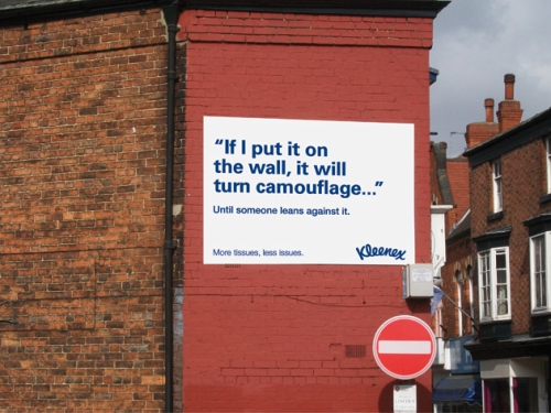
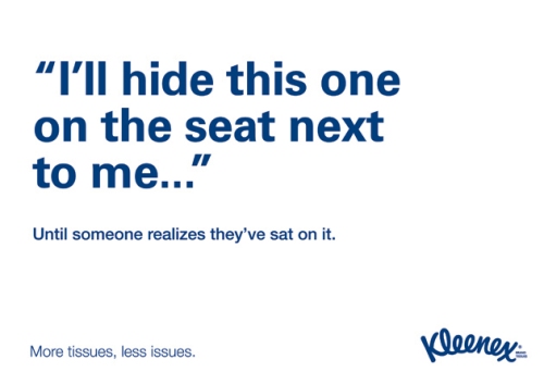
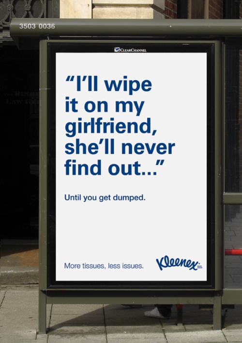
Kleenex YCN Brief
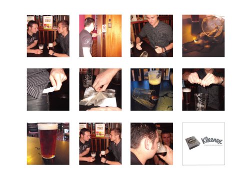
At the end of my second year we were put into groups for two weeks to do one of this years YCN briefs.As a group we chose the one to get men to buy and use kleenex. Here is my idea.
Here is a story board for an advertisement for Kleenex it’s to persuade young men to use and buy more tissues. It shows two men having a drink in a pub, one goes to the toilet whilst the other knocks over his friends drink he pulls a Kleenex from his pocket and mops it up. He then rings it back into the pint glass just in time as his friend comes back from the toilet who is unaware of what’s happened and takes a mouthful of his pint as his friend smiles to himself.
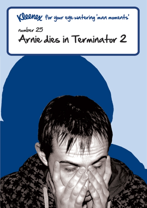
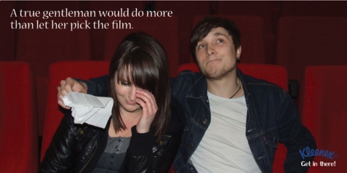
 I recently went on the YCN website to look at who received commendations for this brief, here they are.
Emma Townley & Howard Barker
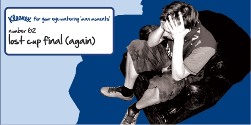
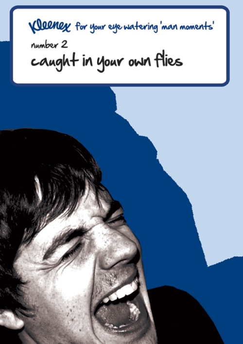
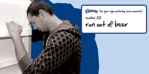
Emma Whalley & Jennifer Walls
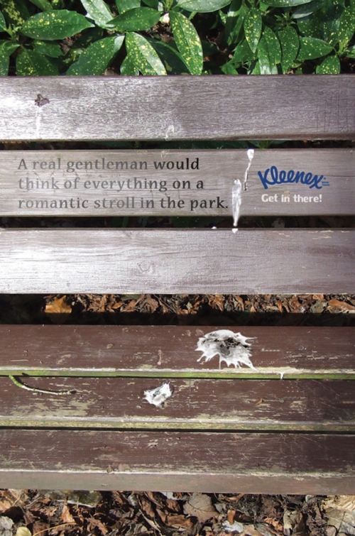
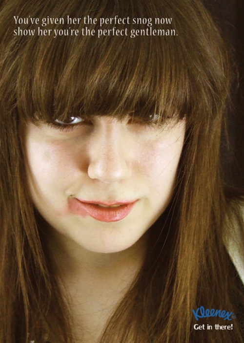
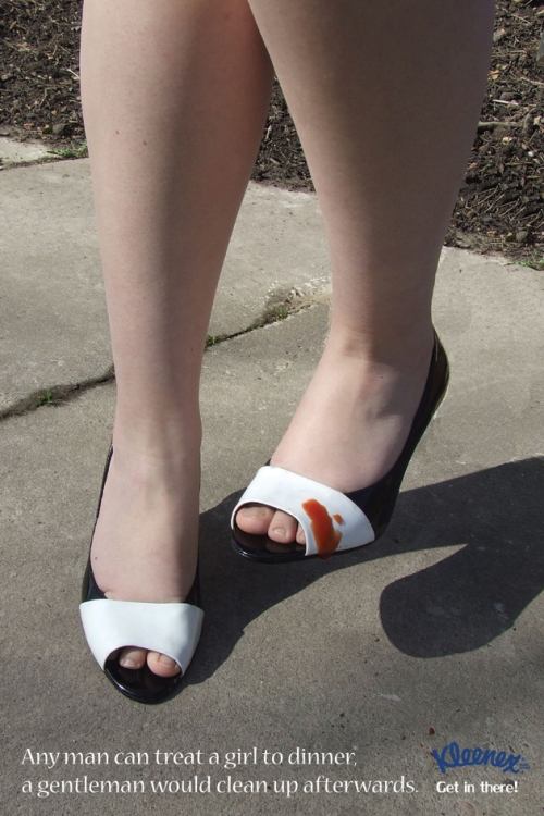
Andy Griffin
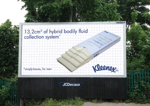
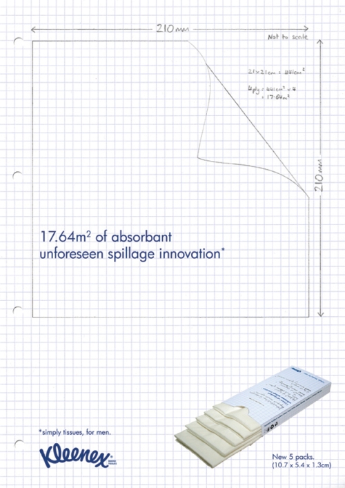
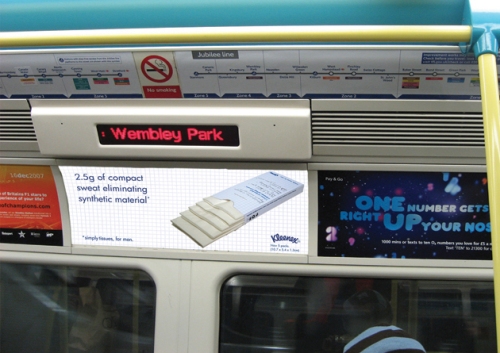
Laura Blackburn
D&AD 2009
I didn’t know what to expect when I went to the d&ad exhibition. The size and content was a surprise. Each University had an area to showcase their work; some had a few rooms others only one. Students’ work was exhibited on the walls and on tables, which included portfolios. Business cards were either on tables, or next to designers work, it was a bit easier to get it from next to their as you didn’t have to root through 20+ cards to find the one you wanted. Students took it in turns to stay in their station, some designers asked if we had and questions etc where others just sat or stud and watched.
Some Universities had books made of their work and were a good way to advertise their work that wasn’t being showcased. It may not be a business card but his or her work and contact details for every graduate was in the book. This is something I believe we need to do next year. The quality of the books was very good. Northumbria University’s book was definitely the most creative it had a carry handle to it and had a white gloss typeface across the cover, with a bright orange neon sticker. Blackpool University went a little further and gave out rock with the dates of the exhibition on and each designer had a note book with one of their designs on the cover. Other universities made packs of postcards to give out they would be bounded together some how and have a postcard for each designer to exhibit their work and information. Uni made their work into a stamp book which you peeled off the designers work and match it with the right image, this made you look at every single persons work that is in that book, unlike at an exhibit where you would just walk past it. The books are tiny but fun to do.
One thing that stuck out a mile when looking at people’s business cards was that at least half of the people their didn’t have a website or didn’t have their Website on their business cards. I BELIEVE THIS IS A MUST SINCE DESIGN IS TURNING DIGITAL OUR WORK SHOULD BE ACCESSIBLE ONLINE FOR AGENCIES WHO ARE INTEREST CAN SEE OUR WORK.
Business Cards
As we went around the exhibition I picked up a variety of business cards. A lot of the business cards were just typographical and some had an image from the persons work. Ones that caught my eye had something a little bit special added to them ,Claire Jenks who created her own scratch-card business card called “the graduate lottery” There are 9 panels to scratch off in 8 of them are different skills. She has the 9th had her contact details. I thought this really worked it would get the agency to interact with the business card making it fun and memorable. One card that caught my eye is one by Kirsty Wright she had re-used an old train ticket, she’s thinking about the environment and sustainability which is a major factor at the moment in design. I myself travel to Uni on the train and I never know what to do with my tickets, they just end up at the bottom of my bag. Other did it through humour. one female decided to have a picture of a penis close up as the front of her business card on the back it read, ‘now that I have your attention.’ That would be one card you could spot easily in a pile. Another has got an illustration image of a woman in stockings and suspenders and you lift up her pants and it says ‘please hire me.’ This brings both humour and interactivity together. Jessica Crass has designed a typographic card using mustard and white colours but has added a bit of humour about her surname. Crass id written largely on the front of the card on the back it reads, ‘my name not my nature.’ Just that little something to make you remembered helps I think I certainly noticed it.
One business card had a fake moustache added toi it and underneath the words ‘ideas to smooth your moustache too.’ The back of the card isn’t very exciting but the whole interactive business card with added humour does work. Another card with a use of humour is one by Kayleigh Allen she uses fluorescent ink to print, ‘Another bloody student.’
One University I can’t remember which one had theses as their business cards there’s a barcode on the back which you put in a scanner that brings up the pdf of the person so you can view a variety of their work. There is a card by Lee Lok Neville which I didn’t realise till later was 2 cards in 1. This means a business card has been wasted it’s an easy mistake to make.
Some business cards are created with other materials such as plastic, these also stand out because of its material not what’s on it, is this a good thing?
Most business cards are a regular rectangular size. Others re different shapes and sizes. One was a beer mat which had a design and typeface to match the idea. I really like this one, the only problem was colour as the type in some places isn’;t very legible. Two girls made their business cards that little bit special. One was the colour and feel of an orange peel it’s a shame it didn’t smell like one. She would have had to think about the colours and paper a little bit more than others. Another girl had a plain card but on the back was that personal touch she had an apple stick stuck at the back with the slogan,’fresh and sweet.’ and the year, this i believe was a great personal touch too it. One girl made her business card into a CV it has her contact details, experience skills and qualifications. It’s done to a professional standard.
One university made cards which had the product description and contact description and contact details. The images of the product are photographed well with a description of what it is and for. Finally the sam,e girl who created her business card as a CV had her own pens designed too.
Next Year
To get to the standard of presentation some universities did fundraising for us needs to start asap. We need to think about how to sell ourselves. For my negotiated studies I would like to spend a week or two creating my own identity and create my business cards ready for the design world. I think a book needs to be created too to give out, business cards need to be next to the work not on the table and should be personal.


